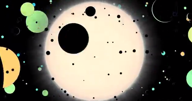
Alex Parker, from the Harvard-Smithsonian Center for Astrophysics, likes to spend his spare time coming up with ways to turn big data into visualizations that highlight both the beauty and the vastness. In his latest effort, he takes data from NASA’s Kepler mission, which is focused on finding Earth-sized planets circling other stars and squeezes it into a mesmerizing three-minute animation.
Learn more about the video here.